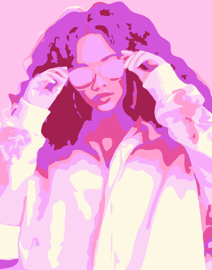
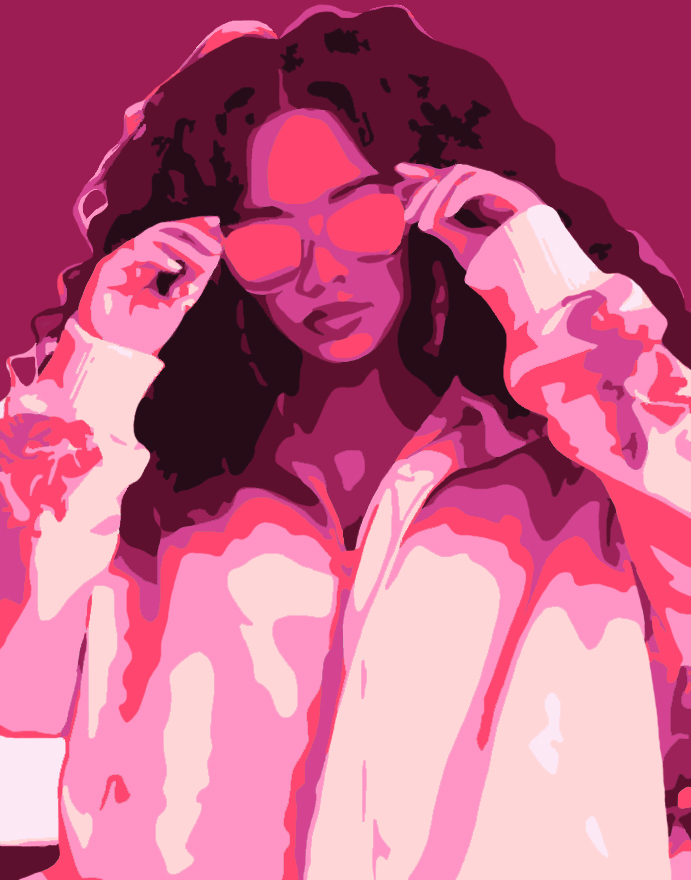
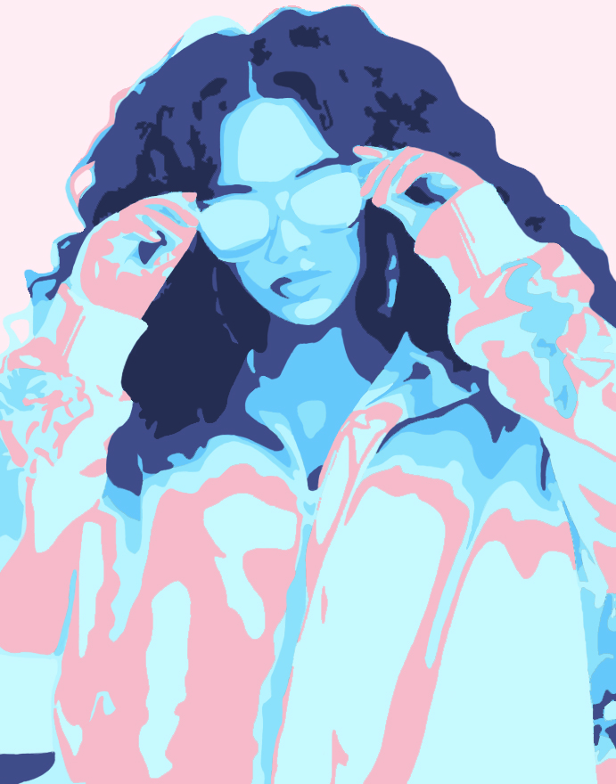
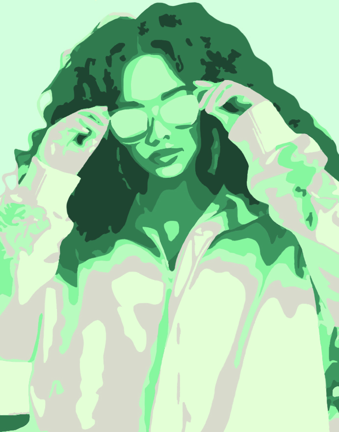
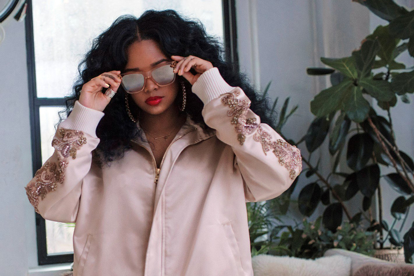
For my celebrity art prints project, I decided the make prints of the singer H.E.R. Going into this project I planned to use the colors yellow, red, blue, and green. I didn’t stick to that idea and just picked colors that I liked. I ended up with blue, pink, red, and green. Altogether, the process was long (for me specifically). Once I picked a photo of a celebrity I like I took it into Photoshop and began adding the grayscale and the filter. The longest part for me was after adding the color and I had to smooth out the roughness. I’m pretty proud of the finished product though. I didn’t have a set plan for what I wanted my piece to feel(?) when you look at it. I tried to keep a theme of pastel-like colors but I’m not sure if I kept that theme well. I think this project challenged my patience and time management while working on it. I spent a long time on trying to perfect it and that took a while. Overall, I like the final product of my piece.