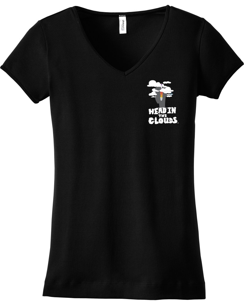
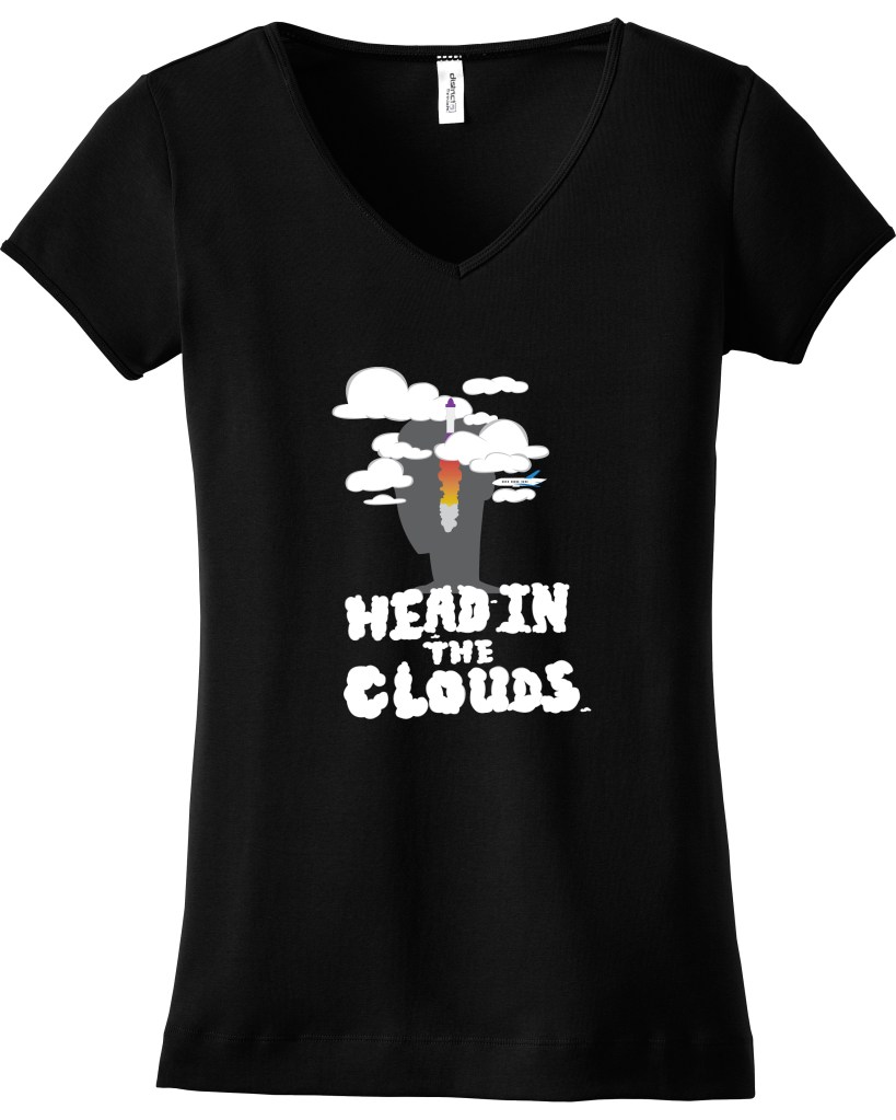
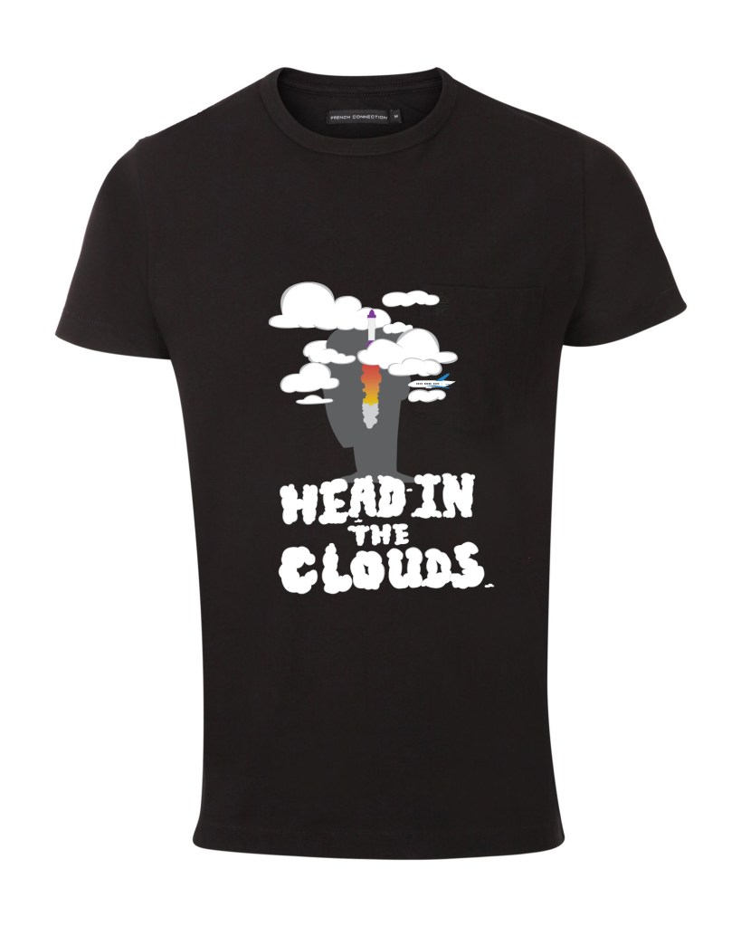
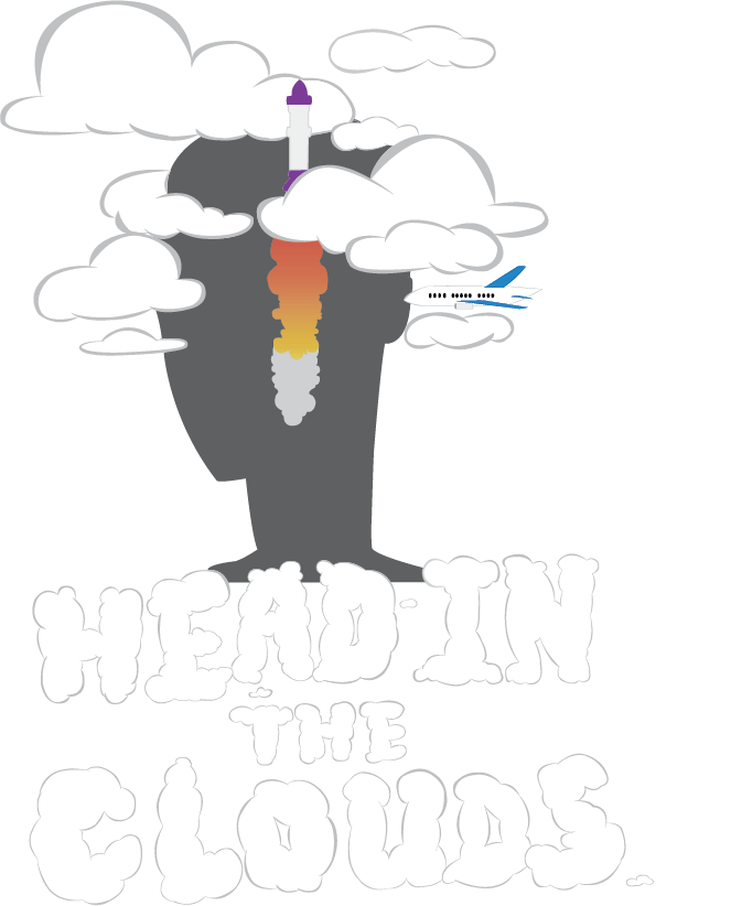
For my t-shirt design, I decided to make it based off the saying “head in the clouds.” There’s no in depth reason to why I chose this, it was a random thought that I just went along with. I started out with the intention of including some pastel colors, but it came out with very little color, I’m fine with it though. I created the silhouette of a character with their head literally in the clouds. I didn’t want the design to just be a character and clouds, so I added the actual quote, but I made the letters look like clouds. I also added a rocket shooting through the clouds and an airplane that looks like it’s about to fly into the character’s ear. I just thought it would go well with the concept because it’s based off the quote “in one ear and out the other” and planes fly at that altitude where it’s in the clouds. I used Photoshop and Adobe Illustrator for this project. I made the actual design in Illustrator and I put the design onto the shirt using Photoshop. I am pretty satisfied with my piece but if I could go back and re-do this or improve anything it’d be the line weight. I don’t think I made it look as neat as I wanted it too and I feel like on certain spots the lines need to be thicker or thinner. I would also go back and completely re-do the rocket because I don’t like how it looks.