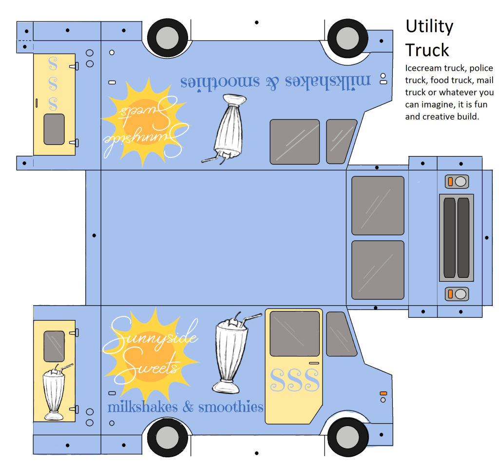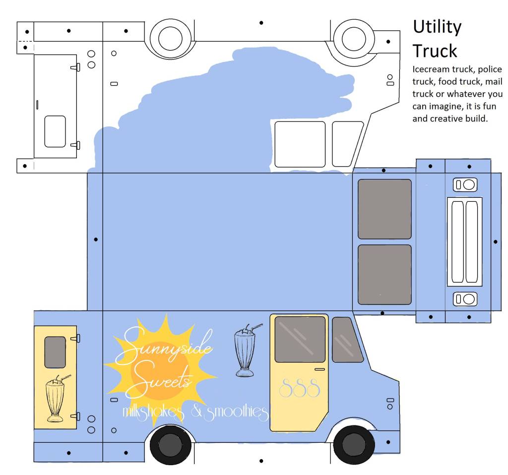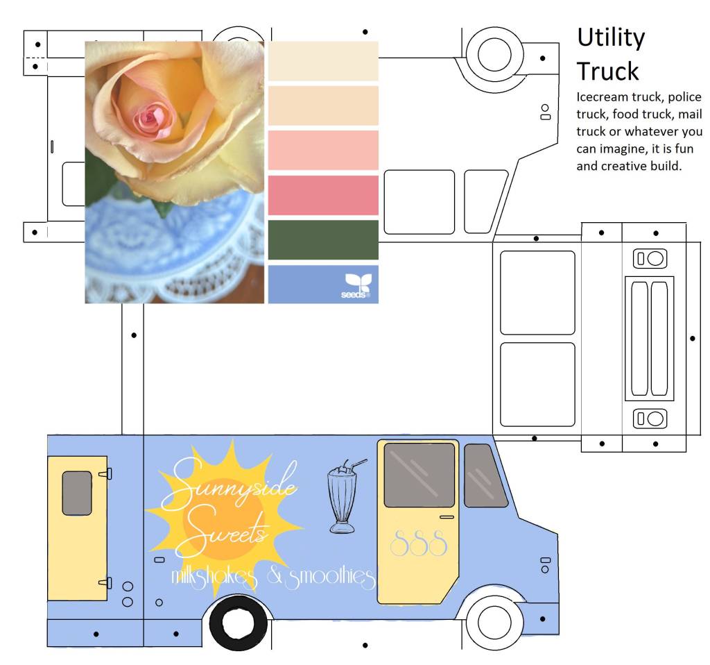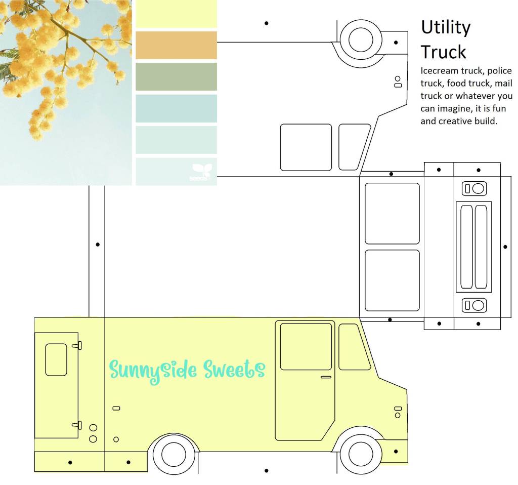
My idea for this project was to go for a sweet theme with lots of pastels. As usual I kind of deviated from that but still the core of the concept is the same. My truck is for milkshakes and smoothies (with maybe some other foods, but mainly those drinks). I named it Sunnyside Sweets because it fits the bright theme I was going for (and the alliteration). For the design I limited my color scheme to light blue and yellow and I think that also plays into the title ‘sunnyside’, the blue symbolizing the sky and the yellow for the sun). I also limited the graphics to use because I couldn’t find many (mainly graphics of the food) that fit what I was going for. When I added the ones I originally picked onto the truck it just looked out of place to me. So I stuck with the sun and an image of a milkshake. I used the sun to be the background for the title so that it would kind of stand out, without it the title seemed to disappear and look boring. I wanted to add the silhouettes of the truck interior but I was running of time so I left that out. So I would go back and add that as well as touch up the bottom version of the truck (I used the brush tool and in a png it doesn’t look as clean). I like my finished design though.