Unfortunate Poster: Artist Statement

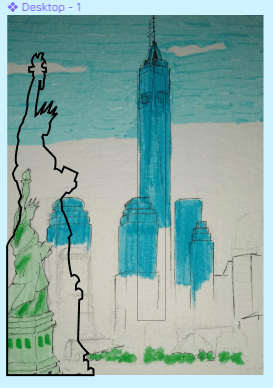
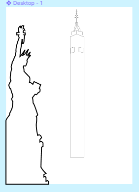
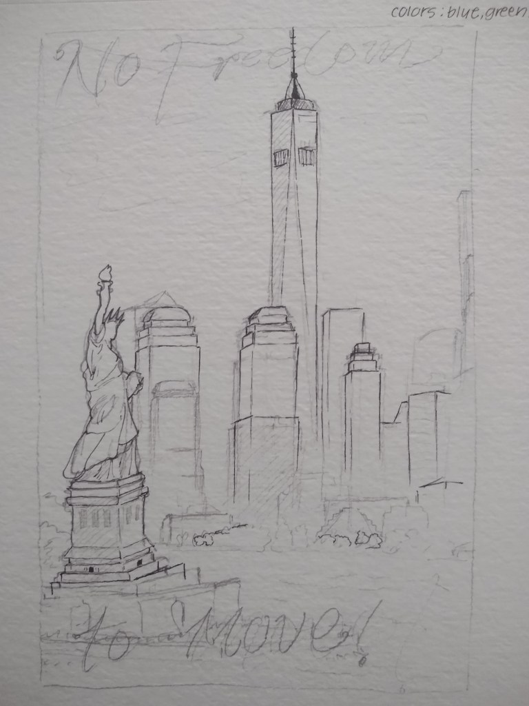
Since the project was based off of reviews of different locations, I stuck with a location. I picked NYC, just because it was the first place that came to mind. The review says “no freedom to move!” which refers to how crowded NYC is so there is limited space to move. But it’s also meant to be a play on words with the statue of liberty and the word “freedom.” Initially, I wanted my project to have color but to stick to a mainly blue and green color scheme. But because I fell a little behind while working on it, I didn’t have tome for that so I made a switch to a black and white outlined style. I put the most detail on the statue because it’s in the foreground and what I want to be focused on the most. But the background is the basic shapes of the buildings (I did the best I could, but I wasn’t trying to get the buildings down perfectly). The main struggle or setback I had was before I switched to just black and white when I realized I wasn’t making closed shapes with the vectors. So, I couldn’t fill in the drawing with color like I intended. Figma was a little confusing at first because I wasn’t used to it, and it had different functions from Adobe Illustrator. But, now that I’m finished with the project it isn’t that bad. I actually kind of like how it came out, I just wish I spent more time on it so I could have done it in color.

Unfortunate Poster

I haven’t posted an update in a while, but I have been working on this a bit and it was kind of frustrating. Initially I meant to outline everything in black and fill in the colors but it didn’t work out. That was because I didn’t know the outline had to be one big shape (so I was just outlining everything, going in different directions but not making the basic shape first). I also tried to merge some vectors together just to make it easier to fill in and navigate (but that just made it more difficult so I stopped). After all of that I got help and realizing I’d messed up I kind of started over. I took the suggestion to do a simple outline style without filling in any color (which should also help me get done faster). I started to re-do the statue but made the lines thicker for the look (I’ll do the same with everything else too, but they will be a little less thicker because they’re in the background). I’m not sure when I’ll get done but I think it’s possible for me to finish by the end of the week .

Collage Project: Artist Statement

For this project I went with the idea of using fruits (oranges and grapefruits for contrast) and arranging them in a circular pattern. I intended for it to look like a sun or flower, but I think the final piece looks kind of abstract and what exactly it is can be left up to the audience to decide. For the process, I went into Pixlr with the two photos of an orange and grapefruit and started making the circle with them. I think that I should’ve used an outline of a circle for a guide because I think it could’ve been more even. It was a repetitive and tedious process, so that along with not being happy with how it was turning out made me unmotivated. But besides that, as I got a little deeper into the project I didn’t realize I had to create negative space. So I tried to space out the rings as it got closer to the center but I didn’t like how it looked because the rings looked uneven (which goes back to me wishing I used an outline). But I tried to fix it by rearranging how they were placed. Lastly, in my sketch I intended for the rings to have the fruits laying vertically as it got to the inner part. I almost scraped that idea but I attempted to do it but it didn’t come out as I planned. It’s also barely visible because the center of the rings are small. Overall, I think I could’ve done better.

(wanted to see how it would look)

Project Proposal (2)

Today I just tried to make the lines in my sketch more definite so I know what to follow when I actually start it. I also started to thing of the color scheme: I’m going to stick to blue and green (and maybe a bit of yellow). I’ll use different values of blue and and green to make contrast. I also thought about the font. I think I want it to be a little similar to the type that I just randomly drew, just more polished.

Unfortunate Poster Project Proposal

So for this project the fisit idea that came to mind was NYC (since the originals were based on locations). So I just went with it and made 2 different sketches but Im showing the one I like better. I came up with a phrase and it says “no freedom to move” which refers to how crowded NYC can get. I also tried to make it relate to the statue of liberty which is in the photo, so I specifically made the sentence include “freedom.”

Collage Project: Day 4 in Pixlr

As I go on in my project I get a little more anxious of how it will turn out. So far its looking ok, I just feel like it looks wonky (most likely because the circles aren’t the perfect shape, or I can’t get the sizing of the pieces right). I may have to work on it outside of class to try to fix some things or just get ahead. For the last few inner rings I just duplicated the previous one, made it smaller, and lined it up. Before that I’d just been making new rings one by one, so I don’t know if duplicating will work out. I also planned to turn the fruits vertically for the rings in the center so I don’t know how that will work out with the negative space. I’ll just try and something on this outside of class…

Collage Project: Day 3 in Pixlr

I finished the 3rd ring today in Pixlr. I noticed that the pieces started to get too crowded. But as I make the pieces smaller though and it gets closer to the center of the circle, I think I can make more negative space. I’m getting kind of nervous with how it will turn out because it’s so crowded. I think it would look better if the pieces were closer in the center, and gets more spaced out as it moves outwards.

As I was making this though, I was thinking if this is more like a sun or flower, so I thought about settling on it being a sun. But I think if it was a sun I would have to switch out the grapefruits for lemons. I was thinking of that because I wanted to put it on a background with an orange sky but I think there’s too much contrast for it to resemble a sun. (Just a thought.)

Collage Project: Day 2 in Pixlr

Today I just made the 2nd ring on the inside. I was contemplating before starting today if the pattern should switch between rings with 2 fruits and rings with 1 fruit. But after looking at the comment I’m just going to alternate with the 2 fruits in 1 ring for the outside, and as I get closer to the inside of the circle I’ll add rings with only one fruit in them.

Also, to try and make the rings more interesting to look at (I guess), as I made the 2nd ring I made sure to line up the fruits to the one opposite of it in the previous ring.

*they’re lined up orange-grapefruit vertically, not like orange-orange/grapefruit-grapefruit*

Collage Project: Starting in Pixlr

So I started my project in Pixlr today and I think I got a good amount done. Since my pattern is like a repeating ring pattern, I started with the outer ring today and finished it. I wasn’t sure if I should do orange and grapefruits alternating in one ring or if there should be one ring for one fruit (if that makes sense). But I ended up doing both fruits on the same ring, and I think it looks nice, but I wonder how it’d look with orange in one ring and grapefruit in another.