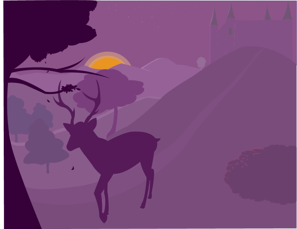
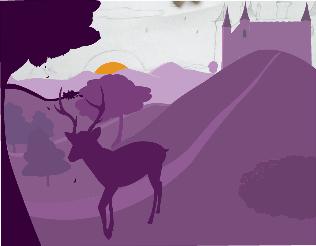
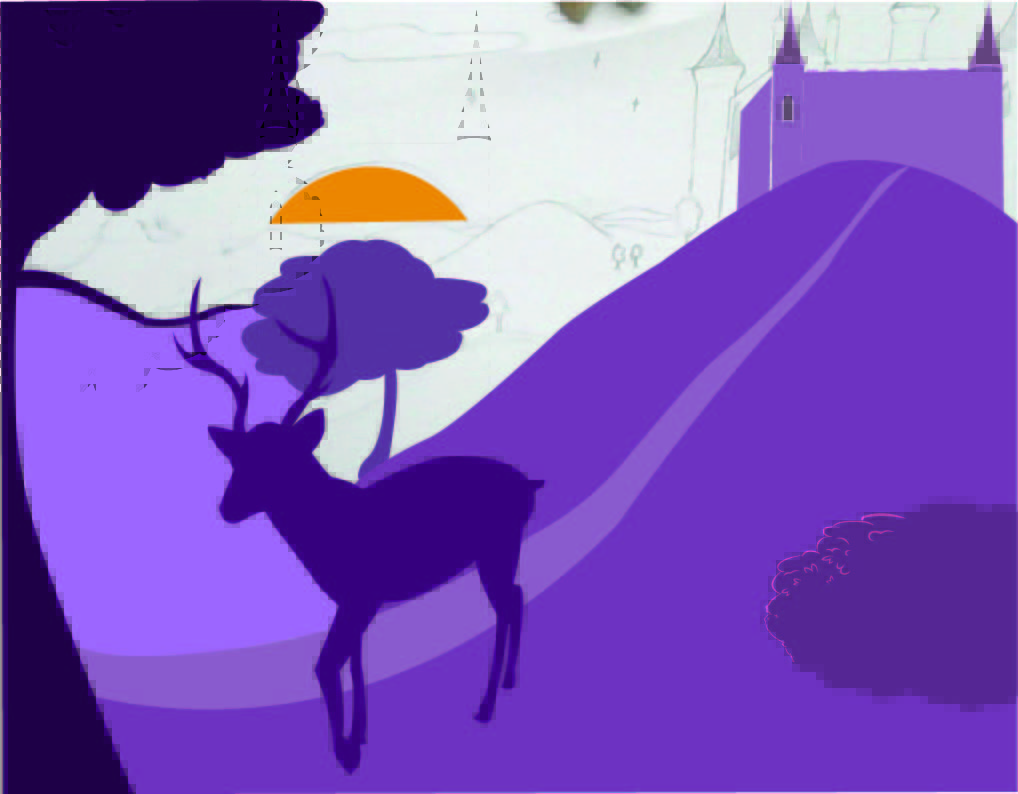
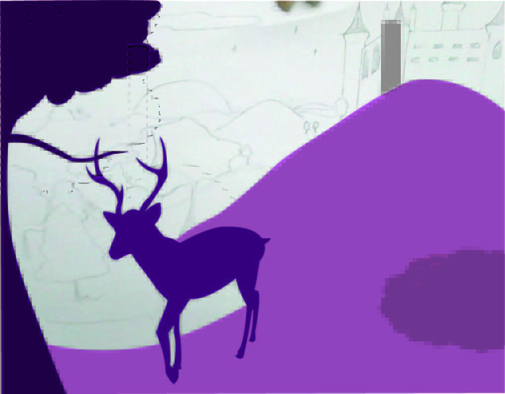
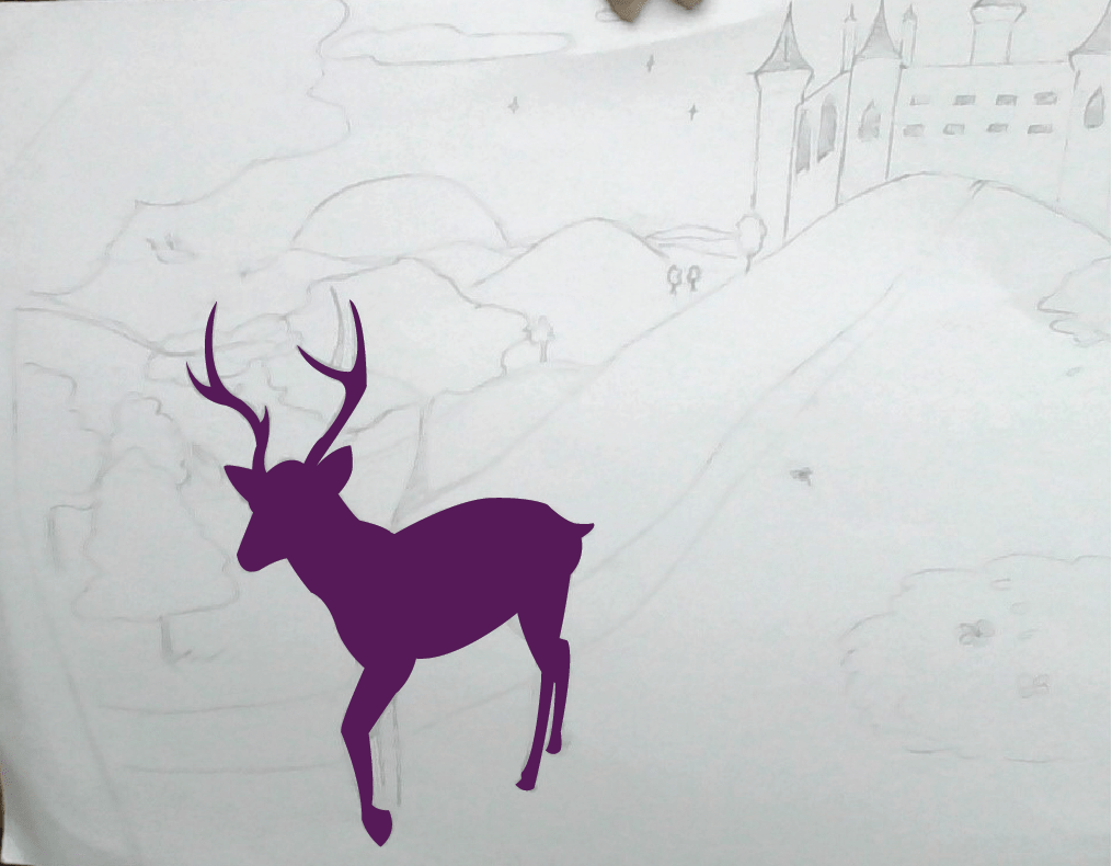
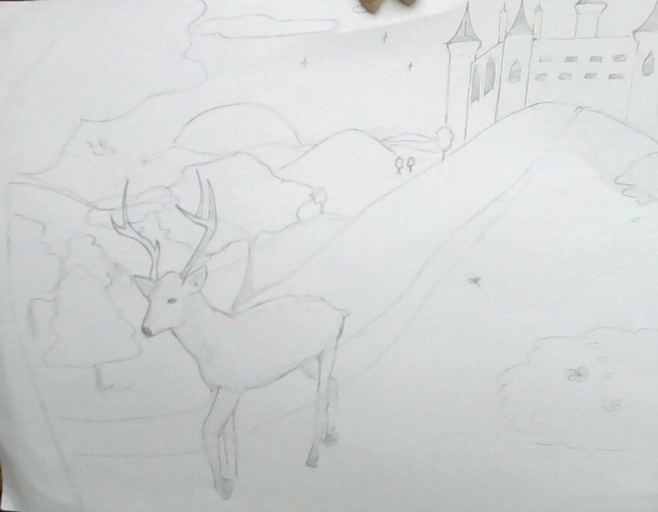
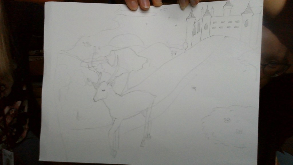
Vector Landscape (4)

I began added some details like highlights to my landscape. I didn’t get to shadows yet, I just wanted to focus on highlights. I highlighted the side of the castle and a little bit of the mountains in the background. I pretty much finished the layout of the middle ground, so now I have to complete the background which hopefully shouldn’t take too long because it’s just the silhouette of mountains. I also added some leaves to the silhouette of the tree so it doesn’t look flat and just to add detail. I didn’t have any complications, but I mainly struggled with trying to find the right colors so it looks consistent. It’s kind of hard for me to gradually make the colors get lighter or the saturation to decrease without it coming off too gray, too blueish, or like a different kind of purple. I’m just waiting for it to come together when I add highlights and shadows.

Vector Landscape (2)

I finished the base for the deer today, and I also did a some of the foreground/ midground. I did the tree in the very front, the hill, the bush, and I began to start laying down the castle. I didn’t get too much into detail, I just laid down the base colors. Once I do that I’ll go back and maybe add shadows and highlights for more detail and to make it pop. But, I did get kinda bored of laying down the colors at one point so I started messing around with some highlight colors. Not sure if you’ll be able to see it, but I added a little bit of highlight to the bush and a little on the hill.

(Also for some reason the colors are coming up a bit funny looking…?)

T-Shirt Design Artist Statement

For my t-shirt design, I decided to make it based off the saying “head in the clouds.” There’s no in depth reason to why I chose this, it was a random thought that I just went along with. I started out with the intention of including some pastel colors, but it came out with very little color, I’m fine with it though. I created the silhouette of a character with their head literally in the clouds. I didn’t want the design to just be a character and clouds, so I added the actual quote, but I made the letters look like clouds. I also added a rocket shooting through the clouds and an airplane that looks like it’s about to fly into the character’s ear. I just thought it would go well with the concept because it’s based off the quote “in one ear and out the other” and planes fly at that altitude where it’s in the clouds. I used Photoshop and Adobe Illustrator for this project. I made the actual design in Illustrator and I put the design onto the shirt using Photoshop. I am pretty satisfied with my piece but if I could go back and re-do this or improve anything it’d be the line weight. I don’t think I made it look as neat as I wanted it too and I feel like on certain spots the lines need to be thicker or thinner. I would also go back and completely re-do the rocket because I don’t like how it looks.

T-Shirt Design (5)

Today I started working on the rocket and airplane. It was a bit weird trying to do the rocket because it goes through the clouds and it’s a layer under the clouds. The outlining process on the rocket was the most weird for me since I was using the pen tool to outline. But it was because I decided not to do the line weight on the rocket and airplane, I wanted the outline to be straight. I also gave the rocket some fire/cloud trail under it so it looks like it’s just taking off. All I have left to complete is the airplane, and outlining the cloud letters on the bottom.